 Resize browser to see the magic. And experience the ride with your wide screen, laptop, ipad, kindle, iphone or any handheld device.
Extra-wide layout
- Details
- Kategorie: Template guide
- Veröffentlicht: Dienstag, 09. März 2021 09:00
- Zugriffe: 4332
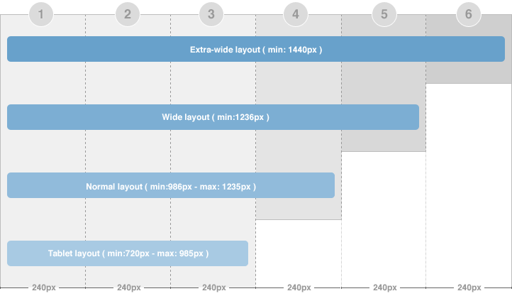
There are 2 width size modes of the content block: in Homepage (considered as list page mode) and in detail page mode. In the Homepage, the width of the content block = 2 grids while in the detail page mode, the width of content block is 3 grids. The above image shows you the layout of homepage of our template --> content block = 2 grid.
To configure for the width of content in homepage and content page (detail page mode), navigate to: [your_site] / templates / ja_elastica / css / layout.css The code for this configuration is located in the line from 86->93, you can change the width here.
Note:
- If there are too many modules, some modules will be auto moved to display under the content block so that your layout will always be nice.
- The settings is the same is for 3 layout types (extra-wide, wide and normal)
The width of the layout is not defined as the way shown in the section above. The width of the layout = 5 grids + extra-column, so we need to know where the extra-column is defined and how it works.
Step 1: you need to note some important information in the file: [your_site] / templates / ja_elastica / blocks / extra-col.php. This file is to define width of the extra column, select css file to display when satisfying defined condition.
{codecitation} <?php // Add css for this extra-wide layout $this->addCSS ('css/layout-extra-wide.css', 'only screen and (min-width:1440px)'); {/codecitation}This code is to add css file (css/layout-extra-wide.css) for the extra-wide layout.
{codecitation}{/codecitation}This code is to define width and style of the extra-column.
Step 2: define the width of the extra-wide layout. Navigate to: [your_site] / templates / ja_elastica / core / etc / layout-extra-wide.css
{codecitation} .main { max-width: 1440px !important; width: 1440px !important; } #ja-main { width: 1200px ; float: left; } {/codecitation}Step 3: you need to define the extra-col block it in the: [your_site] / templates / ja_elastica / core / etc / layouts / default.xml file ( the line 26 as default).
{codecitation} position-7, position-5 extra-col {/codecitation}