 Resize browser to see the magic. And experience the ride with your wide screen, laptop, ipad, kindle, iphone or any handheld device.
Normal layout
- Details
- Kategorie: Template guide
- Veröffentlicht: Dienstag, 09. März 2021 09:00
- Zugriffe: 2331
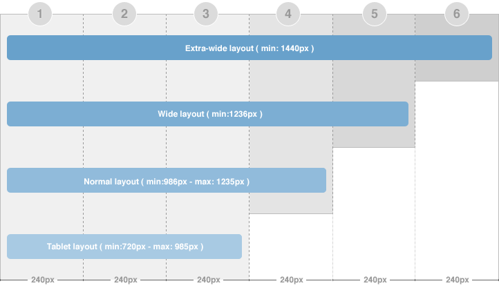
The normal layout uses 4 grids. In Homepage, the content block width = 2 grids. In Detail page mode, the content block width = 3 grids.
How the modules are changed when layout is changed from Wide layout to Normal layout?
The modules in the grid 5 (in Wide layout) will be moved to available grids in Normal layout [grid 3 and 4 or under the content block (in Homepage) and grid 4 or under the content block (in detail page)] in the order from left to right. The moved modules will be located under the modules already in the grids.
To define width of the layout, please navigate to: your_site / templates / ja_t3_blank_featured / core / etc / layouts / default.xml. The file default.xml is to define width range of each layout.
{codecitation}css/layout-normal.css{/codecitation}
As defined here, the layout has minimum width = 986 px and maximum = 1235 px. And with the condition, the layout will use the layout-normal.css file under the your_site / templates / ja_t3_blank_featured / css folder to be the style of the template.